You need a pink button color. You type color: pink into your CSS and get a pale, barely-there blush. That is not what you wanted. You try color: hotpink and get something far more vivid than expected. The CSS pink family spans a wider range than the word pink suggests in everyday speech, from near-white pastels to colors that approach magenta. Knowing where each named pink sits on that range saves the trial-and-error.
The Color Name Finder identifies the closest CSS name for any custom pink HEX you are working with. But before you test a custom value, this guide covers all six named CSS pinks, what each looks like, how they differ from each other, and why pink itself is a more unusual color than it appears.
The Six Named Pink Colors in CSS
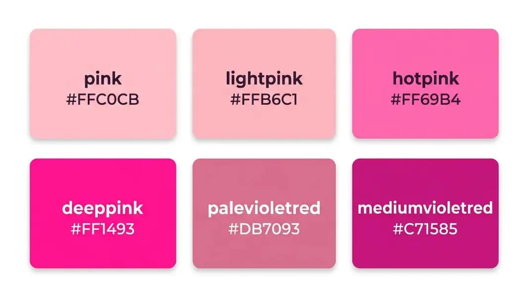
CSS contains six named colors in the pink family. Here they are in order from lightest and most pastel to darkest and most vivid:
| CSS Name | HEX | RGB | Character |
|---|---|---|---|
| lightpink | #FFB6C1 | R:255, G:182, B:193 | Pale, slightly warm pastel |
| pink | #FFC0CB | R:255, G:192, B:203 | Pale blush, slightly warmer than lightpink |
| hotpink | #FF69B4 | R:255, G:105, B:180 | Vivid, saturated pink |
| palevioletred | #DB7093 | R:219, G:112, B:147 | Muted dusty rose with violet undertone |
| deeppink | #FF1493 | R:255, G:20, B:147 | Intense, near-magenta pink |
| mediumvioletred | #C71585 | R:199, G:21, B:133 | Dark, saturated purplish-pink |
One counterintuitive fact in this list: lightpink (#FFB6C1) is actually slightly more saturated than pink (#FFC0CB), even though the name suggests otherwise. Pink has a higher green channel (192 vs 182), which makes it slightly more washed-out. Side-by-side, pink reads as slightly warmer and more muted than lightpink.
Pink and Lightpink: The Pastel CSS Pinks
Pink (#FFC0CB) is one of the original 16 HTML colors and the name most people reach for first. Its RGB is R:255, G:192, B:203. The green channel at 192 and blue at 203 are both high, which means the color is significantly diluted from any vivid red-pink. On screen, CSS pink reads as a soft, pale blush, the kind of pink associated with newborn nurseries and pastel spring palettes.
Lightpink (#FFB6C1) has R:255, G:182, B:193. Despite the "light" prefix, it is very slightly more saturated than plain pink because its green and blue channels are lower. The visual difference is minimal. You need them side by side to see it clearly. Both work for the same design contexts: gentle backgrounds, soft accents, wedding and feminine design systems, and any palette that needs warmth without intensity.
Neither color is appropriate for primary action elements like buttons or CTAs in most interfaces because the saturation is too low for them to draw reliable attention. They work as supporting colors rather than focal colors.
Hotpink: The Vivid CSS Pink
Hotpink (#FF69B4) is where the pink family gets genuinely vivid. Its RGB is R:255, G:105, B:180. The green channel drops to 105, which is a significant reduction from the pastel group, and the blue channel at 180 stays high enough to keep the color clearly in pink rather than sliding toward orange-red.
The name "hotpink" is informal and expressive: it communicates the energy of the color in the name itself. Hotpink is the pink of magazine covers, fashion accents, neon signs, and high-contrast UI elements designed to attract attention. It is vivid but not extreme enough to feel harsh in most contexts.
Hotpink pairs well with black (a classic high-fashion combination), white, and deep navy. It is too vivid for most neutral or earthy palettes and reads as off-theme in professional or corporate design systems unless the brand specifically calls for it.
Deeppink: The Most Intense CSS Pink
Deeppink (#FF1493) is the most intense color in the CSS pink family. Its RGB is R:255, G:20, B:147. The green channel at 20 is dramatically lower than hotpink's 105, which is what creates the near-magenta quality. Deeppink sits at the boundary between pink and magenta. The very low green channel means almost no warmth is mixed in, producing a color that reads as electric.
The name is accurate. Deeppink is not a subtle or versatile color. It demands attention in any context. On a white background it reads as a bright signal color. On a black background it glows. It is not appropriate for body text, large background areas, or anything requiring extended visual comfort.
Deeppink is useful for specific purposes: notification badges, active state indicators, hover effects on fashion or beauty sites, and any context where the design intent is specifically maximalist or high-energy. It is a specialized tool rather than a general-purpose color.
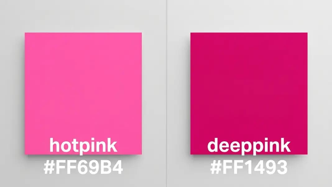
The difference between hotpink and deeppink is the most common source of confusion in the CSS pink family. The key is the green channel: hotpink (G:105) has enough green to feel warm and saturated; deeppink (G:20) has almost no green and reads as a pure, cold-leaning vivid pink.
Palevioletred and Mediumvioletred: The Muted Pinks
Palevioletred (#DB7093) and mediumvioletred (#C71585) are classified as pinks but they have a more violet, purplish quality than the other four. Both sit at the boundary between the pink family and the red-purple family.
Palevioletred (#DB7093) has RGB R:219, G:112, B:147. The red channel is not maxed (219 vs 255 for the other pinks), the green channel is at 112, and the blue is at 147. This balance produces a desaturated, dusty pink with a warm undertone. The color reads as vintage rose or antique pink rather than vivid or modern pink. It is sometimes called dusty rose in paint and fabric contexts. Palevioletred is the most versatile of the CSS pinks for neutral-adjacent design because its lower saturation lets it sit comfortably alongside warm grays, tans, and creams.
Mediumvioletred (#C71585) is dark and saturated with R:199, G:21, B:133. It sits closest to the color families boundary between pink and purple. On screen it reads as a deep, vivid magenta-pink, almost like a darker version of deeppink with more purple in it. Mediumvioletred is the least common of the six pinks in everyday web design but appears in data visualization when you need a saturated color that is distinctly different from both red and purple.
Non-CSS Pink Color Names Designers Actually Use
The six CSS pinks cover a fraction of the pink names that appear in design tools, paint brand charts, and brand style guides. These names are not official CSS named colors, but they have widely understood hex ranges used consistently across design software.
Blush pink: A pale, warm, skin-adjacent pink. Approximate hex: #F4C2C2. Common in wedding design, beauty branding, and any palette that needs warmth without saturation. Blush sits between lightpink (#FFB6C1) and a warm skin tone.
Millennial pink: A cultural color name for the desaturated, dusty pink widely associated with mid-2010s branding and packaging. Approximate hex: #E8B4B8. It sits near palevioletred but lighter and more gray-washed. Less saturated than any CSS pink.
Rose pink: A medium, slightly muted warm pink with a visible red lean. Approximate hex: #E8899A. Rose has a warmer quality than the cooler violet-leaning pinks like palevioletred. In design, rose and blush are often used interchangeably, though rose is slightly more saturated.
Dusty rose: A muted, gray-washed warm pink. Approximate hex: #C9868F. Dusty rose appears widely in wedding and interior design. It is the closest design-world name to CSS palevioletred, which is why palevioletred is sometimes called dusty rose in design discussions.
Salmon pink: A warm pink with a significant orange component. True salmon sits around #FF9480 to #FFB09A. CSS salmon (#FA8072) is more orange-adjacent than most design usage of the word salmon. Salmon pink reads as pink to most viewers despite the orange lean.
Coral pink: Brighter than salmon with a cleaner pink quality. Approximate hex: #FF6B81. CSS coral (#FF7F50) reads as orange-adjacent; coral pink in fashion and interiors is pulled more toward pink than the CSS version.
Fuchsia: In CSS, fuchsia is identical to magenta (#FF00FF). In common usage, fuchsia refers to a vivid pink-purple. The range #C40078 to #FF2DA0 covers most common fuchsia references. Fuchsia and deeppink are often confused because both read as electric, saturated pinks.
Rose gold: A warm metallic pink with a brown or tan component. Approximate hex: #B76E79 to #D4A5A5 for the pinkish reference version. Rose gold itself is a material finish, but the associated color name has a consistent visual meaning in design: a warm, slightly muted, metallic-adjacent pink.
The Color Name Finder maps any of these non-CSS hex values to their nearest official CSS name, which is useful when you need to translate a design spec hex into code. Most of these names map to palevioletred, pink, or hotpink depending on saturation and warmth.
For colors where the pink starts to cross into violet or purple territory, the shades of purple color names guide covers the range from mediumvioletred into the violet family.
Why Is Pink Not on the Visible Light Spectrum?
Pink is unusual in color science because it does not appear on the visible light spectrum. The spectrum runs continuously from violet (around 380nm) through blue, green, yellow, orange, and red (around 700nm). There is no wavelength of light that looks pink.
Pink is produced when the eye and brain receive red light and blue or violet light simultaneously. Because red and violet are at opposite ends of the spectrum, no single wavelength combines them. Only mixing two light sources, or having a material that reflects both red and blue-violet frequencies, produces pink.
This makes pink what some color scientists call an extra-spectral color: a color that exists in human perception but not as a single wavelength. The same category includes magenta, which is why magenta and pink look related even though they have different names.
The consequence for CSS is that the pink family blends characteristics of red (the red channel is always high) and blue or violet (the blue channel contributes the cool quality). Adjusting the balance between those channels is what distinguishes the six CSS pinks from each other.
How Do You Find the Closest CSS Name for a Custom Pink?
If you have a custom brand pink or a pink from a design tool and want to know which CSS name is closest, paste the HEX into the Color Name Finder. The tool's perceptual matching will tell you whether your pink lands closer to palevioletred (if it is muted and violet-leaning), hotpink (if it is vivid and warm), deeppink (if it is very saturated and blue-leaning), or plain pink (if it is pale and pastel).
For custom pink shades that sit between two CSS names, the Color Name Finder picks the perceptually closest one using Delta-E in CIE Lab space, which gives a more reliable result than simple RGB distance.
Once you have the closest CSS name as a reference point, the tints and shades generator lets you generate lighter and darker variants of any base pink to build a complete scale. Starting from hotpink, you can generate a full range from near-white blush through vivid hotpink down to deep burgundy-adjacent tones, all sharing the same underlying hue. The color section has all the tools for working with pink shades once you have the base color identified.