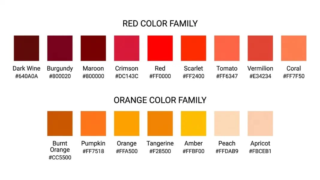
You spec a background as "orange" and the client says it is too bright. You try "burnt orange" and the developer asks which hex code you mean. The word orange covers more perceptual ground than any other color name in English, and the shades within it have specific names that carry meaning in design, fashion, CSS, and everyday language.
The Color Name Finder matches any orange hex against the full CSS named color set using perceptual distance matching, which returns the closest standard name for any custom value you are working with. This guide covers every major shade of orange, the names designers and developers use for them, and the exact hex codes behind each family.
Quick Reference: Orange Color Names and Hex Codes
| Color Name | Hex Code | RGB | Family |
|---|---|---|---|
| Peachpuff | #FFDAB9 | R:255, G:218, B:185 | Pale orange |
| Apricot | #FBCEB1 | R:251, G:206, B:177 | Pale orange |
| Bisque | #FFE4C4 | R:255, G:228, B:196 | Pale orange |
| Papayawhip | #FFEFD5 | R:255, G:239, B:213 | Pale orange |
| Moccasin | #FFE4B5 | R:255, G:228, B:181 | Pale yellow-orange |
| Lightsalmon | #FFA07A | R:255, G:160, B:122 | Light warm orange |
| Salmon | #FA8072 | R:250, G:128, B:114 | Pink-orange |
| Coral | #FF7F50 | R:255, G:127, B:80 | Mid warm orange |
| Orange | #FFA500 | R:255, G:165, B:0 | Standard orange |
| Darkorange | #FF8C00 | R:255, G:140, B:0 | Vivid deep orange |
| Tangerine | #F28500 | R:242, G:133, B:0 | Vivid warm orange |
| Pumpkin | #FF7518 | R:255, G:117, B:24 | Deep warm orange |
| Tomato | #FF6347 | R:255, G:99, B:71 | Red-orange |
| Orangered | #FF4500 | R:255, G:69, B:0 | Near-red orange |
| Vermillion | #E34234 | R:227, G:66, B:52 | Artist red-orange |
| Burnt orange | #CC5500 | R:204, G:85, B:0 | Dark muted orange |
| Rust | #B7410E | R:183, G:65, B:14 | Dark red-brown orange |
| Terracotta | #C04000 | R:192, G:64, B:0 | Earthy dark orange |
| Sienna | #A0522D | R:160, G:82, B:45 | Brown-orange |
| Amber | #FFBF00 | R:255, G:191, B:0 | Yellow-orange |
How Orange Color Names Are Organized
Orange sits between red and yellow on both the RGB additive color model and the RYB traditional color wheel. The position on the orange spectrum is controlled almost entirely by a single variable: the green channel value in RGB.
In standard CSS orange (#FFA500), the formula is R:255, G:165, B:0. The red channel stays at maximum (255) across almost every named orange. The green channel drops as the color moves from yellow-orange toward red-orange. At G:165, you have standard orange. At G:127, you have coral. At G:69, you have orangered. At G:0, you have pure red.
This means every orange shade can be located on the spectrum by its green channel value. Pale oranges achieve lightness by adding blue (B:185 for peachpuff), not by reducing saturation. Dark muted oranges like burnt orange and rust reduce the red channel below 255, which is what gives them their depth and warmth without the harshness of a dark vivid orange.
There is also a historical footnote relevant to why "orange-red" remains a common search term: the word "orange" as a color name entered English around 1512, borrowed through Old French and Arabic from the fruit name. Before that, what we now call orange was described in English as "yellow-red" or "saffron." The keyword "orange red color" traces back to exactly that older naming convention.
Pale Orange Color Names: Peach, Apricot, and Soft Tones
Pale oranges are high-brightness oranges with blue added to the formula. They read as warm, soft, and skin-adjacent rather than vivid or energetic.
Peachpuff is a CSS named color at #FFDAB9 (R:255, G:218, B:185). It is one of the palest named oranges in CSS, with a significant blue component (185) that cools and lightens the hue. Peachpuff reads more pink than orange in most contexts.
Bisque is CSS #FFE4C4 (R:255, G:228, B:196), slightly warmer and less pink than peachpuff. Bisque implies the color of unglazed pottery and warm cream, and functions as a subtle warm background tint in design.
Papayawhip is CSS #FFEFD5 (R:255, G:239, B:213), the palest of the CSS orange family. The name refers to the pale inner flesh of ripe papaya. It is pale enough to serve as a warm white alternative.
Apricot is not a CSS named color. Common design usage places apricot around #FBCEB1 to #EEA880. Apricot has more visible orange than peach and less pink. It reads clearly as a pale orange rather than a pale pink, which is the key distinction for design and fashion use.
Moccasin is CSS #FFE4B5 (R:255, G:228, B:181). Technically in the yellow-orange territory, named after the soft leather color of moccasin footwear. It sits at the warm, slightly peachy end of the yellow family and is used as an earthy light accent.
Standard Bright Oranges: Tangerine, Pumpkin, and Vivid Shades
These are the oranges most people picture when they hear the word. Vivid, warm, and energetic.
CSS orange is #FFA500 (R:255, G:165, B:0). This is the base reference. G:165 is approximately 65% of the maximum green value, which places it exactly at the perceptual midpoint of the orange hue. When a designer says "orange" without qualification, #FFA500 is the closest standard anchor.
Darkorange is CSS #FF8C00 (R:255, G:140, B:0). The green channel drops to 140, making it distinctly deeper and more vivid than standard orange without adding any red. Darkorange is the go-to CSS orange for interface elements that need to read as bold and warm but not aggressive.
Tangerine is not a CSS named color. Common usage places it around #F28500 to #FF8800. Tangerine implies a warm, slightly red-leaning vivid orange, named after the Tangerine variety of mandarin citrus. It sits between CSS orange and darkorange in most implementations.
Pumpkin maps to approximately #FF7518 (R:255, G:117, B:24). The blue component (24) is what separates pumpkin from standard oranges: it adds warmth without adding red in the conventional sense. Pumpkin is used heavily in autumn design contexts and is a close match to the actual color of Cucurbita maxima rinds.
To explore orange tints and shades from any of these base values, the tints and shades generator produces the full lightness range from any input hex.
Red-Orange Shades: Coral, Tomato, and Vermillion
Red-orange colors are where orange begins to tip into red territory. CSS draws a clear line here: orange uses a maximum green channel, but the red-orange colors all have significantly reduced green values.
Coral is CSS #FF7F50 (R:255, G:127, B:80). At G:127, coral sits at almost exactly half the green value of standard orange. The blue component (80) prevents it from reading as pure red-orange. Coral is one of the most design-usable CSS oranges because it reads as warm and approachable rather than alarming.
Tomato is CSS #FF6347 (R:255, G:99, B:71). The name refers to the ripe tomato color, which contains both red and orange. With G:99 and B:71, tomato is clearly in red-orange territory. It has a warm, slightly rustic quality that distinguishes it from the brighter vivid oranges.
Orangered is CSS #FF4500 (R:255, G:69, B:0). Despite containing the word "orange," this color sits close to red on the visible spectrum. With G:69, the green contribution is small enough that most viewers would describe orangered as a very warm red rather than an orange. It is used for high-urgency signals and alerts.
Vermillion is the traditional artist pigment for red-orange, approximately #E34234 to #D9381E depending on the source. Historically, vermillion was mercury sulfide (cinnabar), an intensely pigmented red-orange used in Renaissance paintings and ancient Chinese lacquerwork. Modern vermillion pigments are cadmium-based or synthetic. In design, vermillion implies a heritage, slightly earthy red-orange with more historical weight than the CSS names carry.

Dark and Muted Oranges: Burnt Orange, Rust, and Terracotta
Dark muted oranges are where the orange family becomes most useful for interior design, fashion, and branding that needs warmth without energy. These colors achieve their character not by adding black, but by reducing both the red and green channels together.
Burnt orange sits around #CC5500 to #BF5700. The R:204 (down from 255) and G:85 (down from 165) combine to produce a color that reads as darkened AND desaturated simultaneously. The term "burnt" in color naming specifically means this dual reduction, as if the original pigment had been subjected to heat that charred both its brightness and vividness. This distinguishes burnt orange from a simple darker orange.
Rust maps to approximately #B7410E (R:183, G:65, B:14). With all three channels significantly reduced and a small but present blue component, rust reads more brown than orange in isolation. It implies oxidized iron and carries an industrial, aged quality. Rust became prominent in interior design palettes from 2018 onward as a warmer alternative to millennial pink.
Terracotta is approximately #C04000 (R:192, G:64, B:0). The name comes from the Italian for "baked earth," specifically the unglazed fired clay used in pottery and roofing tiles. Terracotta has more red presence than rust and a slightly less brownish quality. It is a primary color in Mediterranean and Southwestern design aesthetics.
Sienna is a CSS named color at #A0522D (R:160, G:82, B:45). It is named after the city of Siena in Tuscany, where the earthy reddish-brown pigment was mined. CSS sienna sits at the warm brownish end of the orange family. Raw sienna (the lighter natural pigment) maps to approximately #E1781D, while burnt sienna (heat-treated) maps to approximately #C36A2D, darker and more muted.
What Is the Difference Between Orange and Amber?
Amber and orange are frequently confused because both are warm, yellow-leaning colors. The distinction is precise: amber sits between yellow and orange, while CSS orange sits between yellow-orange and red-orange.
CSS orange (#FFA500) has G:165. Standard amber references cluster around #FFBF00 to #FFC200, with a green channel around 190 to 195. The higher green channel in amber pushes it visually toward gold territory. Amber reads as warm and slightly golden in most design contexts; orange reads as more saturated and clearly orange.
The amber name originates from the fossilized tree resin used since ancient times as jewelry and protective coatings. Natural Baltic amber ranges from pale yellow (#FAE264) to deep reddish-brown (#6D3B08), with the most recognized amber color at the warm honey-gold midpoint. For amber alongside other mineral and natural color references, the gemstone and metallic color names guide covers the full spectrum.
A useful design rule: amber works as a premium warm accent, particularly in contexts with gold or honey associations. Orange works as an energetic, attention-capturing accent. The two are not interchangeable in palette construction because amber pairs naturally with neutrals and greens, while orange pairs with blues and contrasting teals.
What Makes a Color Orange Versus Red-Orange?
The boundary between orange and red-orange is not arbitrary. It maps directly to the RGB green channel value.
Pure red in RGB is #FF0000 (G:0). Pure orange in CSS is #FFA500 (G:165). The midpoint between them is approximately G:82, which lands near coral (#FF7F50 at G:127) on the warm side and approaching tomato (#FF6347 at G:99) on the cooler side.
A practical rule for working with custom hex values: any orange-family color with a green channel above 120 will read as orange. Any color in the same family with a green channel below 90 will read as red-orange or near-red to most viewers. The range between 90 and 120 is the genuine red-orange crossover zone where viewer perception splits depending on context.
The red-orange color names guide covers the crossover zone in detail, including vermillion, flame, scarlet-orange, and the specific design contexts where red-orange is a more versatile accent than pure red or pure orange. For the complementary color reference, the red and orange color names guide covers dual-hue palettes and how red and orange interact when used together in the same palette.
CSS Named Orange Colors: The Complete Reference
The CSS color specification does not have a separate orange family section. These are the colors from the full CSS named color list that have an orange perceptual identity, sorted from lightest to darkest.
| CSS Name | Hex | RGB | Visual Character |
|---|---|---|---|
| papayawhip | #FFEFD5 | R:255, G:239, B:213 | Near-white warm cream |
| moccasin | #FFE4B5 | R:255, G:228, B:181 | Pale warm yellow-orange |
| peachpuff | #FFDAB9 | R:255, G:218, B:185 | Pale pink-orange |
| bisque | #FFE4C4 | R:255, G:228, B:196 | Warm cream-orange |
| lightsalmon | #FFA07A | R:255, G:160, B:122 | Light warm orange-pink |
| orange | #FFA500 | R:255, G:165, B:0 | Standard vivid orange |
| darkorange | #FF8C00 | R:255, G:140, B:0 | Deep vivid orange |
| salmon | #FA8072 | R:250, G:128, B:114 | Medium pink-orange |
| coral | #FF7F50 | R:255, G:127, B:80 | Warm medium orange |
| tomato | #FF6347 | R:255, G:99, B:71 | Warm red-orange |
| orangered | #FF4500 | R:255, G:69, B:0 | Near-red orange |
| sienna | #A0522D | R:160, G:82, B:45 | Dark earth brown-orange |
To find the closest CSS named color for any custom orange hex, enter the value into the Color Name Finder, which uses Delta-E perceptual distance to match against the full 148-color CSS named set.
For checking whether any orange works for text on a colored background, the contrast checker verifies WCAG AA and AAA compliance. Standard CSS orange (#FFA500) on a white background has a contrast ratio of 1.9:1, which fails WCAG AA for text at any size. Most vivid oranges require a dark background to meet accessibility minimums.
The shades of yellow color names guide covers the yellow-orange crossover zone, including gold and amber hex codes, and explains how the yellow CSS family overlaps with the warm orange end of the spectrum.