A brand brief says "keep the palette soft and approachable." An interior designer says the room needs "warm, inviting tones." A client rejects a proposed palette because it "feels too cold." These descriptions are about color temperature and saturation, the two dimensions that sit behind every pastel, warm, and cool color name.
The terminology for color temperature is less standardized than most designers expect. "Pastel" has a specific technical meaning (high brightness, low saturation) but is used loosely for anything that looks soft. "Warm" and "cool" describe hue bias (red-yellow vs. blue) but also undertone (a white can be warm or cool within the white range). Understanding these distinctions makes the color name finder results more interpretable, since knowing whether a hex falls in the warm or cool range helps predict what it will do in a palette context.
This guide covers pastel color names, warm color names, and cool color names, with the specific shade names used in design vocabulary and the hex codes that define each.
What Makes a Color Warm, Cool, or Pastel
Color temperature is not about the physical temperature of anything. It is about visual association and hue position on the color wheel.
Warm colors have red or yellow as their dominant hue. They are associated with fire, sunlight, and heat. Warm colors visually advance: they appear to come toward the viewer on a flat surface. In a room, warm wall colors make the space feel smaller and more intimate.
Cool colors have blue as their dominant hue. They are associated with water, sky, and shadow. Cool colors visually recede. In a room, cool colors make the space feel larger and more open.
Neutral colors (white, gray, beige, brown) can have warm or cool undertones. A warm white has a yellow undertone. A cool white has a blue undertone. A warm gray has a yellow-brown lean. A cool gray has a blue lean. This is why two whites or two grays can look wrong together even when both appear neutral in isolation.
Pastel colors are not a temperature category. They are a saturation-and-brightness category. A pastel color is any hue that has been significantly lightened by adding white, resulting in a pale, low-saturation shade. Pastel warm colors (blush, peach, butter yellow) and pastel cool colors (mint, baby blue, lavender) both exist. The unifying quality is softness, not temperature.
Pastel Color Names: The Complete List with Hex Codes
Every hue family has a recognized pastel range, each with specific names.
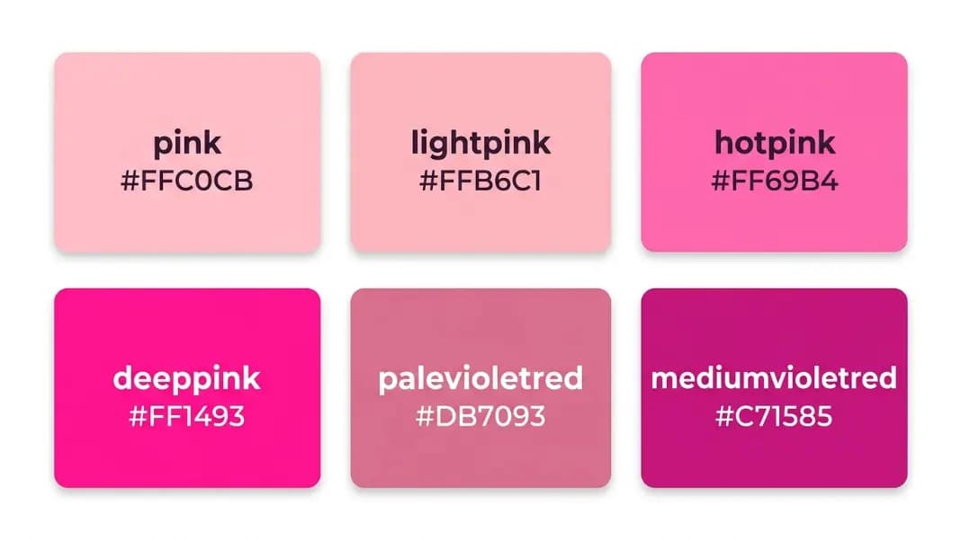
Pastel Pink (Red family): Blush (#DE5D83 to #FFCDD9 range), ballet pink (#EF98A0), baby pink (#F4C2C2), rose (#FFD4D4), mistyrose in CSS (#FFE4E1). The palest pinks lose their pink quality and read as near-white.
Pastel Orange: Peach (#FFDAB9 in CSS as peachpuff), apricot (#FBCEB1), blush-peach (#FFCBA4). Pastel oranges are the warmest of the pastels and often overlap with warm pink.
Pastel Yellow: Butter yellow (#FFFD82 to #FFFACD), lemon (#FFF44F), cream (#FFFDD0). CSS cornsilk (#FFF8DC) and lemon chiffon (#FFFACD) fall in this range.
Pastel Green: Mint (#AAF0D1 to #D0F0C0), seafoam (#9FE2BF), celadon (#ACE1AF), sage (#B2AC88, though sage is muted rather than pure pastel). CSS honeydew (#F0FFF0) and mintcream (#F5FFFA) sit at the very pale end.
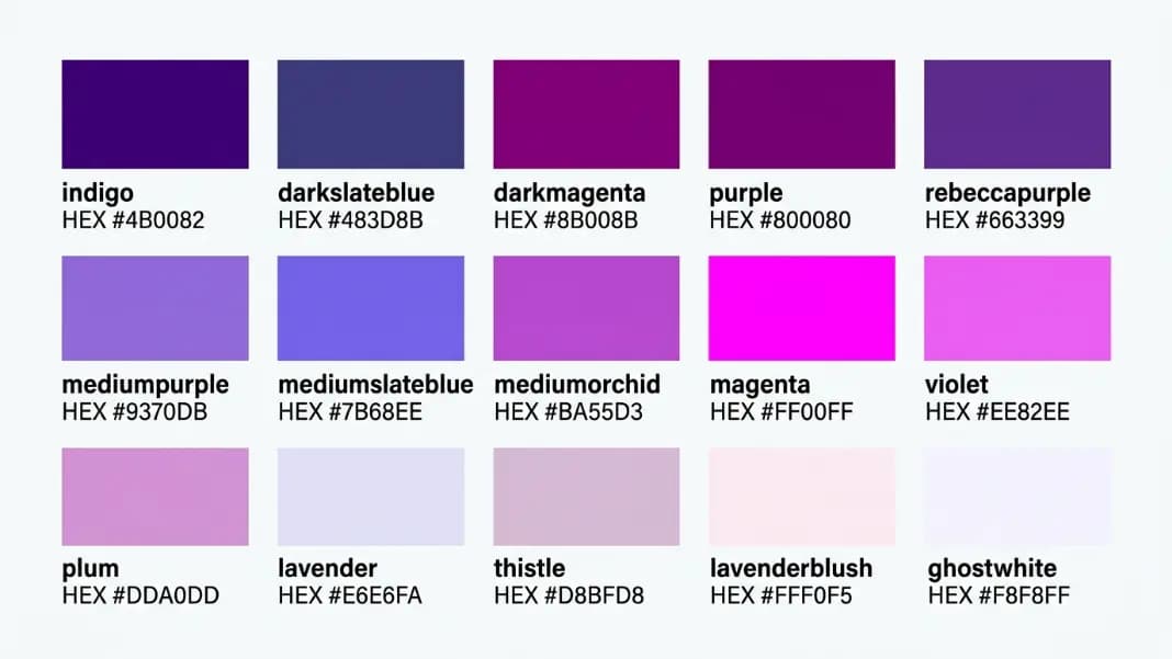
Pastel Blue: Baby blue (#89CFF0), powder blue (#B0E0E6 in CSS as powderblue), sky blue (#87CEEB in CSS), periwinkle (#CCCCFF). CSS aliceblue (#F0F8FF) and lavender (#E6E6FA) sit at the palest blue-purple edge.
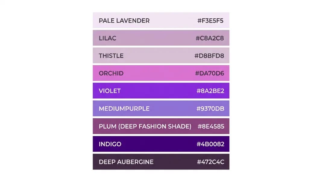
Pastel Purple: Lavender (#E6E6FA in CSS), lilac (#C8A0D8 approximately), wisteria (#C9A0DC), thistle (#D8BFD8 in CSS). These are the most named group of pastels in the CSS specification.
Warm Color Names: Reds, Oranges, and Yellows
Warm colors span from the vivid end through medium and into the muted, desaturated warm neutrals.
Scarlet: A vivid bright red with an orange undertone. CSS has no named scarlet; it falls around #FF2400. More orange-leaning than crimson.
Crimson: A deep, vivid red with a blue undertone. CSS crimson is #DC143C. The blue undertone makes crimson cooler than scarlet despite both being red.
Coral: A warm red-orange, between pink and orange. CSS coral is #FF7F50. Coral is widely used in design as a friendlier, more approachable alternative to pure red.
Salmon: A pale warm pink-orange. CSS salmon is #FA8072, which is medium-warm. Salmon in interior design describes colors in the #FFA07A to #FA8072 range. CSS lightsalmon (#FFA07A) is the paler version.
Tangerine: A vivid, pure orange with slight warmth. CSS has no named tangerine; it falls around #F28500.
Amber: A warm golden-orange. CSS has no named amber; it typically falls around #FFBF00. Amber implies the specific quality of the resin, a warm translucent golden-orange.
Marigold: A warm golden-orange, slightly yellower than amber. Approximate hex: #EAA220.
Gold: CSS gold is #FFD700, a vivid pure yellow-gold. In design, gold as a color name often implies a metallic quality that the flat CSS hex does not represent. Goldenrod (#DAA520) and darkgoldenrod (#B8860B) sit in the darker warm-yellow range.
Mustard: A deep, muted warm yellow. Approximate hex: #FFDB58 for brighter mustard, #E1AD01 for the more muted vintage version. Mustard is a warm yellow with enough muting that it reads as earthy rather than bright.
Cool Color Names: Blues, Greens, and Neutral Cools
Navy: A deep dark blue. CSS navy is #000080. One of the most consistently defined color names across industries.
Cobalt: A vivid medium-to-dark blue. No CSS named cobalt; it falls around #0047AB. Cobalt implies a specific vivid quality distinct from navy's darkness or sky blue's lightness.
Teal: CSS teal is #008080, a medium cyan-blue-green. Teal in design covers a range from darker versions (#2E8B8B) to lighter aqua-leaning versions. It is one of the most versatile cool colors in design.
Turquoise: CSS turquoise is #40E0D0, a vivid cyan-green. Mediumturquoise (#48D1CC) and darkturquoise (#00CED1) are in the same family but darker.
Aqua: CSS aqua is #00FFFF, the same as cyan. Aqua in everyday design vocabulary often means a medium cyan-blue-green, closer to teal than to pure cyan.
Sage: A muted, gray-green. Approximate hex: #B2AC88. Sage sits at the cool-warm boundary: its green content reads as cool, but the gray and slight yellow undertone keep it from reading as cold.
Mint: A pale, bright green with a cool quality. CSS mintcream (#F5FFFA) is at the palest end. True mint is closer to #AAF0D1. Mint green implies freshness and a slight coolness.
Slate: A cool medium blue-gray. CSS slategray is #708090, slateblue is #6A5ACD. In interior design, slate describes a medium cool gray with a blue lean.
Periwinkle: A pale blue-purple, distinctly cool. CSS does not have a named periwinkle; it falls around #CCCCFF. Periwinkle became a significant trend color in the early 2020s.
Soft Color Names: The Space Between Pastel and Muted

Soft colors are pastels with additional gray in the mix, creating a more desaturated, sophisticated look. They are sometimes called "dusty" or "muted" versions of their parent color.
Dusty Rose: Approximately #C4A2A4. Blush with gray added. More complex and versatile than pure blush pink.
Dusty Blue: Approximately #8DA7BE. Sky blue with gray added. A standard color in Scandinavian and Japandi interior design palettes.
Dusty Lavender: Approximately #9B8EAD. Lavender with gray added. More sophisticated than pure lavender for adult design contexts.
Sage: As mentioned above, sage is naturally a muted warm green-gray that functions as a soft cool-neutral.
Muted Teal / Dusty Teal: Approximately #669999. Teal with gray reducing its saturation. Widely used in design systems where standard teal would be too vivid.
Fog: A very pale blue-gray. Approximately #D4D8E0. Often used in digital UI design as a secondary background color.
Warm Sand / Warm Cream: Pale warm neutrals at the warm edge of soft colors. These sit between beige and cream and function as warm near-neutrals in palettes.
Bright Color Names: High Saturation Across the Spectrum
Bright colors are fully saturated, high-intensity versions of any hue. In design, they function as accents and call-to-action elements rather than dominant palette colors.
Electric Blue: A vivid, high-intensity blue close to pure blue. Approximate hex: #0043B5.
Neon Green: A vivid yellow-green exceeding standard green saturation. Approximate hex: #57FF20. CSS lime (#00FF00) is the closest named equivalent.
Hot Pink: A vivid, highly saturated pink. CSS hotpink is #FF69B4. Closer to pink-magenta in visual quality.
Vivid Red: CSS red (#FF0000) is the fully saturated reference. Most design uses of "vivid red" target this range.
Sunshine Yellow: A vivid warm yellow. CSS yellow (#FFFF00) is the fully saturated version. In design, sunshine yellow sits around #FDD835.
The color name finder is particularly useful with bright colors because the CSS named color set covers the outer edge of the spectrum well: red, lime, blue, yellow, aqua, and fuchsia are all fully saturated and precisely defined.
Using Color Temperature in Design Palettes
Color temperature in palette design is most visible at the edges. A palette built entirely with warm colors reads as energetic and intense. A palette built entirely with cool colors reads as calm and receding. Most effective palettes balance warm and cool, typically with a warm dominant color and a cool accent or vice versa.
The more common decision point is undertone: choosing whether warm or cool neutrals anchor the palette. A warm white, warm beige, and warm gray create a cohesive foundation with warm accent colors. A cool white, cool gray, and slate create a cohesive foundation with cool accent colors. Mixing warm and cool neutrals creates tension that reads as unresolved.
For building palettes with specific warm and cool color anchors, the palette generator creates harmonious color combinations from any input hex. For the complete pastel, warm, and cool CSS named colors organized by category, the color tools section is at /color.
Related color vocabulary reference: pink color names covers the pastel-to-vivid pink spectrum in detail, and purple color names covers the cool-to-warm purple range including lavender, lilac, and indigo.