The brief says "bold red." One designer sends crimson. Another sends tomato. A third sends the CSS red #FF0000. All three look different on screen, print differently, and read differently in a brand context. Red has the most recognizable names but also the most imprecise shared meaning of any common color. The gap between what "red" means to the client and what it means to the designer is almost always about warm versus cool undertone.
Red color names divide along one primary axis: whether the red leans toward orange (warm) or toward blue-purple (cool). Scarlet, tomato, vermilion, and coral lean warm. Crimson, ruby, burgundy, and wine lean cool. CSS red (#FF0000) sits exactly in the middle, which is why it reads as slightly artificial rather than matching any naturally occurring red. The color name finder maps any red hex to its nearest CSS named color, useful for understanding where a specific red sits in the spectrum relative to the named standards.
This guide covers every named red and orange shade, from the vivid primary reds through dark burgundies and maroons, and from vivid CSS orange through amber, pumpkin, and burnt orange.
How Red and Orange Color Names Are Organized
Red and orange sit adjacent on the color wheel, sharing the warm side of the spectrum. Red has blue and yellow as its two directions: toward blue makes it cooler and darker (crimson, burgundy, wine), toward yellow makes it warmer and lighter (scarlet, tomato, coral).
Orange sits between red and yellow. Moving toward red produces red-oranges (coral, tomato, flame). Moving toward yellow produces yellow-oranges (amber, marigold, gold). The fullest orange sits at the midpoint.
Saturation is the second axis. Vivid, fully saturated reds and oranges (CSS red, CSS orange) carry maximum visual impact. Dark, desaturated versions (maroon, burnt orange, terracotta) carry more sophistication and work better as dominant palette colors. Most premium and fashion branding uses the desaturated, complex end of both families.
Vivid Red Color Names: Scarlet, Crimson, and Pure Reds
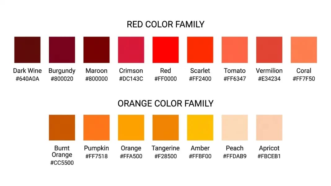
Red: CSS red is #FF0000, the pure fully saturated RGB red. It reads as vivid and bold but slightly artificial because no natural object is this pure a red. In design, CSS red works well for error states, alerts, and high-urgency messaging. It is rarely used as a brand color for precisely this reason.
Scarlet: A vivid red with a warm orange undertone. CSS has no named scarlet. Approximate hex: #FF2400. Scarlet reads warmer and more energetic than CSS red. In fashion, scarlet implies the classic British red with visible warmth. In design, scarlet works where red needs approachability without crossing into orange.
Vermilion: A vivid orange-red, historically the most prized warm red pigment. Approximate hex: #E34234 to #FF4D00. Vermilion reads warmer than scarlet and sits closer to orange than CSS red. Used in signal design, traditional Chinese lacquer, and East Asian art as the ceremonial red.
Crimson: A vivid deep red with a blue undertone. CSS crimson is #DC143C. The blue lean makes crimson cooler and richer than scarlet. It pairs well with navy, dark purple, and gold. Most "classic red" brand colors sit in the crimson range rather than the pure CSS red, because crimson reads as more sophisticated without sacrificing vividity.
Flame: A vivid orange-red suggesting the color of a combustion flame, approximately #E25822. Flame sits between scarlet and orange and is used in energy brand palettes.
Ferrari red (Rosso Corsa): The Italian racing red used on Ferrari Formula 1 cars and production vehicles. Approximate hex: #D40000. It reads darker and more saturated than CSS red, with a slight orange quality. In design, Ferrari red describes a premium vivid red that reads as intentional rather than default.
Dark Red Color Names: Burgundy, Maroon, and Wine
Dark reds are the most wearable and design-usable members of the red family. Their reduced brightness makes them suitable as dominant colors rather than accents.
Burgundy: A dark red-purple named after the wines of Burgundy, France. Approximate hex: #800020 to #722F37. Burgundy sits at the intersection of red and purple, reading as rich, sophisticated, and premium. It is one of the most consistently used dark red names across fashion, interior design, and branding.
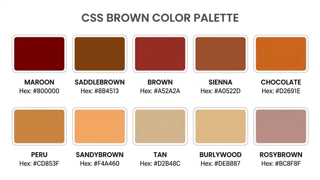
Maroon: CSS maroon is #800000, a very dark brown-red. It reads as significantly darker and more muted than burgundy and lacks burgundy's purple quality. Maroon in everyday use describes the brownish-red of maroon athletic uniforms and school colors. The CSS hex is accurate to this interpretation.
Wine: A dark red similar to burgundy but with more blue-purple depth, approximately #722F37 to #5B1E3A. Wine implies the specific color of aged red wine, which has a visible purple quality.
Oxblood: A very dark red-brown with a muted quality, approximately #4A0000 to #660000. Oxblood implies depth and richness without vividity. Common in leather goods, fashion accessories, and premium footwear color naming.
Ruby: A vivid medium-deep red with a slight blue quality. Approximate hex: #9B111E. Darker and slightly more blue than CSS crimson but not as dark as maroon. The full ruby description is in the gemstone and metallic color names guide.
Garnet: A very dark red with a brown quality, slightly less blue than wine. Approximate hex: #732639. Garnet implies depth and a slightly aged quality.
Mahogany: A dark reddish-brown at the border between red and brown, approximately #C04000 to #8B0000. CSS mahogany does not exist; the closest named CSS color is darkred (#8B0000). Mahogany in fashion and interior design describes the richest end of the dark red-brown range.
Orange-Red Color Names: Tomato, Coral, and the Red-Orange Transition
The orange-red family sits between red and orange on the color wheel. These are the warmest reds and the most vivid oranges that still read primarily as red.
Tomato: CSS tomato is #FF6347, a vivid orange-red that accurately represents the color of a ripe tomato. It is one of the more recognizable CSS named colors in the red family and reads as clearly warmer than CSS red.
Orangered: CSS orangered is #FF4500, a vivid vivid orange-red that sits between tomato and pure orange. Its saturation is extremely high and it reads almost like a neon version of red-orange.
Coral: CSS coral is #FF7F50, a warm red-orange with visible softness. Coral sits between tomato (redder) and orange (more orange), reading as approachable and warm. It became a major trend color in the late 2010s.
Salmon: CSS salmon is #FA8072, a pale warm pink-orange. Lighter than coral, salmon reads as soft and warm. CSS lightsalmon (#FFA07A) is the even paler version.
Vermilion (repeat): In the traditional color wheel used in pigment mixing, vermilion sits precisely at the red-orange boundary, which is why it fits in both categories.
Orange Color Names: The Full Spectrum
Orange: CSS orange is #FFA500, a vivid pure warm orange at medium brightness. The standard reference for orange in digital design. It reads as energetic, warm, and friendly.
Darkorange: CSS darkorange is #FF8C00, a slightly darker, more saturated orange. It reads as more intense than CSS orange and is used where orange needs more authority.
Tangerine: A vivid, slightly warm orange named after the fruit. CSS has no named tangerine. Approximate hex: #F28500. Tangerine implies the specific vivid citrus orange of a tangerine's peel.
Pumpkin: A warm, medium-dark orange in the full-saturation range, approximately #FF7518. Pumpkin orange implies the vivid orange of a mature carving pumpkin. Seasonal design use is obvious, but it also works in warmth-forward brand palettes year-round.
Amber: A warm golden-orange with visible depth. CSS has no named amber. Approximate hex: #FFBF00. Amber implies the warm, slightly transparent quality of amber resin. In the pastel and warm guide on warm and cool color names, amber is listed as a mid-range warm golden-orange.
Apricot: A pale warm orange, lighter than peach and more orange. Approximate hex: #FBCEB1. Used in cosmetics, fashion, and interior design as a soft warm accent.
Peach: CSS peachpuff is #FFDAB9, a very pale warm orange-pink. In everyday use, peach describes anything from #FFDAB9 to #FFCBA4. Peach is the palest end of the orange family and overlaps with the pink range.
Dark Orange and Burnt Color Names
The dark and muted end of the orange family is where orange becomes most useful as a primary design color, because the reduced brightness removes the aggressive quality of vivid orange.
Burnt orange: A dark, muted orange suggesting the color of charred or oxidized orange. Approximate hex: #CC5500 to #BF5700. Burnt orange reads as earthy and warm without the visual loudness of vivid orange. It is a major fashion and interior color that returns to prominence in warm-palette design cycles.
Rust: A dark orange-red-brown, the color of oxidized iron. Approximate hex: #B7410E. Rust is distinct from burnt orange (which is more purely orange) and from terracotta (which is more red). Rust implies an aged, industrial quality.
Terracotta: A warm orange-red-brown named after unglazed fired clay. Approximate hex: #CC5500. Terracotta is more red than burnt orange and more orange than rust. It dominated interior design in the early 2020s and remains prominent.
Brick: A warm dark red-orange named after fired brick, approximately #9C4A1A to #CB4154. Brick orange has more red than terracotta and less than maroon, sitting at the muted edge of the red-orange range.
Yellow-Orange Color Names

Marigold: A warm golden-orange, slightly yellower than amber. Approximate hex: #EAA220. Marigold in design describes a rich warm orange-yellow used in pattern and textile contexts.
Gold: CSS gold is #FFD700, a vivid warm yellow-gold. Sitting at the yellow end of the orange family, gold carries warmth without appearing fully orange. It is discussed in detail in the gemstone and metallic color names guide.
Amber (yellow variant): At its most yellow-adjacent form, amber sits around #FFBF00 to #FFD000, reading as a warm golden yellow rather than orange. This is the amber most often used in warning systems and signals.
Saffron: A vivid warm yellow-orange named after the spice. Approximate hex: #F4C430 to #E8920A depending on interpretation. Saffron implies a specific rich warmth that amber does not carry.
Tangerine (yellow-leaning): The most yellow-leaning tangerine sits around #F4A460 to #F4A223, distinguishable from pure orange by its clearly yellow warmth.
CSS Named Reds and Oranges: The Complete Reference
| CSS Name | Hex | Visual Quality |
|---|---|---|
| red | #FF0000 | Pure vivid red |
| crimson | #DC143C | Vivid deep blue-red |
| darkred | #8B0000 | Very dark desaturated red |
| firebrick | #B22222 | Dark medium red-brown |
| indianred | #CD5C5C | Medium muted pink-red |
| lightcoral | #F08080 | Light muted pink-red |
| tomato | #FF6347 | Vivid orange-red |
| orangered | #FF4500 | Vivid very warm orange-red |
| coral | #FF7F50 | Warm medium orange-red |
| salmon | #FA8072 | Medium warm pink-orange |
| lightsalmon | #FFA07A | Light warm pink-orange |
| orange | #FFA500 | Pure vivid orange |
| darkorange | #FF8C00 | Vivid dark orange |
The most useful observation in this table: CSS has no named scarlet, burgundy (beyond maroon), vermilion, or rust. Designers working with these commonly used names must specify hex values directly. The color name finder is useful for identifying which CSS named color most closely matches any custom warm red or orange hex.
Red and Orange in Design: Making Warm Palettes Work
Red and orange are the most visually demanding colors in design. Used at full saturation, they dominate any composition they appear in. The design choice is almost always about whether to use the vivid versions as small accents or to use the desaturated, dark versions as primary palette anchors.
For accent use, CSS red (#FF0000), crimson (#DC143C), and darkorange (#FF8C00) are the most effective because they read clearly even at small sizes. For primary palette colors, burnt orange, burgundy, terracotta, and rust provide warmth without overwhelming the composition.
The most common mistake is treating all reds as interchangeable. A cool red (crimson) and a warm red (scarlet) create completely different moods in identical compositions. Testing both before committing to a palette is worth the time.
For building complete palettes around any red or orange anchor, the palette generator creates harmonious combinations. For the full range of CSS named colors at any hue position, the color name finder identifies the best match. All color tools are in the color tools section.