You have a primary brand color and need to build a full palette around it. You try adding colors by instinct. Some combinations feel balanced and others feel jarring, but you cannot explain why, and you cannot predictably move from "this works" to building out a complete system.
The Color Schemes Generator takes any base color and generates the complementary, analogous, triadic, split-complementary, tetradic, and square palettes derived from it. This guide covers how each harmony type is defined mathematically on the color wheel, which type works best for which design context, common mistakes that make generated palettes unusable, and how to turn a generated palette into a design system with clear roles for each color.
What Is Color Harmony?
Color harmony is a principle from color theory that describes which color combinations feel balanced, pleasing, or visually coherent. The principle has a mathematical basis: harmonious colors tend to have predictable geometric relationships to each other on the color wheel.
The color wheel organizes hues by their position at angles from 0 to 360 degrees. Red sits at 0 degrees. Moving clockwise, yellow-green sits around 90 degrees, cyan around 180 degrees, and blue-violet around 270 degrees. The exact positions vary slightly by color model (RYB vs. RGB vs. HSL) but the relationships hold across models.
Harmony types are defined by the angle relationships between colors:
- Two colors at 180 degrees apart: complementary
- Two colors at 30 degrees apart (or a cluster of adjacent colors): analogous
- Three colors at 120 degrees apart: triadic
- One base color plus two colors each 30 degrees away from its complement: split-complementary
- Four colors at 90 degrees apart forming a square: square
- Four colors forming two complementary pairs: tetradic (rectangle)
Understanding these relationships lets you build palettes predictably rather than by trial and error.
The Six Harmony Types: A Reference Table
This table maps each harmony type to its mathematical definition, its visual character, and the design contexts where it works best:
| Harmony Type | Relationship on Wheel | Visual Character | Best Used For |
|---|---|---|---|
| Complementary | 2 colors, 180 degrees apart | High contrast, vibrant, dynamic | CTAs, sport brands, attention-grabbing elements |
| Analogous | 3-5 colors, 30 degrees apart | Calm, unified, low tension | Backgrounds, nature themes, calming UIs |
| Triadic | 3 colors, 120 degrees apart | Vibrant, balanced, bold | Playful brands, children's media, creative apps |
| Split-complementary | Base + 2 colors 30 deg from complement | High contrast with more variety | Most versatile; easier to balance than pure complementary |
| Square | 4 colors, 90 degrees apart | Rich variety, high energy | Complex illustrations, games, fashion |
| Tetradic (rectangle) | 4 colors, two complementary pairs | Maximum variety | Dominant color needed to anchor the scheme |
Complementary: Red and green. Blue and orange. Purple and yellow. These pairs create the strongest visual contrast. When placed together, complementary colors appear to vibrate. This works well for high visual energy but needs careful management: one color should dominate and the other should serve as an accent, never split 50-50.
Split-complementary is the harmony type worth starting with for most branding and UI projects, even though it appears further down in the table. It delivers contrast in the same range as complementary but the two accent colors are easier to balance against each other than a single strong complement. Pure complementary works at small scale (a button, a badge, an icon highlight) but at full-page scale the opposing colors compete unless one is heavily desaturated or confined to a small surface area.
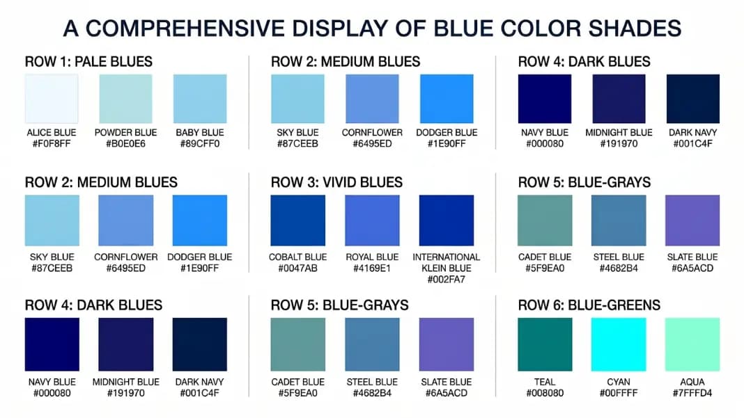
Analogous: Blue, blue-green, and teal. Red, red-orange, and orange. These schemes feel natural because adjacent hues appear together in nature: the colors of a sunset, a forest, or a clear sky. When working with a blue-anchored analogous palette, the shades of blue color names reference gives named options across the hue range so you can pick values by name rather than by eye. Analogous colors are the easiest to use in large areas because there is no tension between the hues.
Triadic: Red, yellow, and blue. Green, orange, and violet. Because all three colors are far apart on the wheel, each contributes its full character. The challenge is balance: all three competing colors at equal weight creates visual chaos. Apply one as the dominant background color, use another as the primary content color, and reserve the third for accents only. If your triadic palette includes purple or violet, the shades of purple color names reference helps you find the specific tone that fits the scheme's weight.
Split-complementary: Instead of the direct opposite of your base color, take the two colors adjacent to that opposite. This keeps the high contrast of a complementary scheme while giving you more flexibility. It is generally the easiest high-contrast scheme to work with because the two accent colors are slightly more related to each other than a single complement would be.
Square and tetradic: Four-color schemes provide the most variety but require the most careful application. Always designate one color as clearly dominant. Four equal-weight colors at full saturation compete with each other and the result looks cluttered.

How to Read a Color on the Color Wheel
Every color has three components in the HSL (Hue, Saturation, Lightness) model, which maps directly to the color wheel concept:
Hue: The position on the wheel, expressed in degrees from 0 to 360. Red is 0, yellow is around 60, green is 120, cyan is 180, blue is 240, magenta is 300. Hue is the quality that makes colors feel different from each other.
Saturation: How vivid or pure the color is, from 0% (pure gray) to 100% (full color). A red at 100% saturation is fire-engine red. The same hue at 20% saturation is a dusty pink-gray. Reducing saturation moves a color toward neutral without changing its hue.
Lightness: How light or dark the color is, from 0% (black) to 100% (white), with 50% being the pure hue. Adjusting lightness lets you generate tints (lighter versions) and shades (darker versions) of any hue.
When you generate a color scheme, the generator creates palette colors by rotating the hue while keeping saturation and lightness similar. This is why the generated colors in a triadic scheme feel related even though they span the full wheel: they share a similar visual weight and vibrancy. The full range of color tools on the site lets you move from generating a scheme here to applying individual colors and gradients in follow-on steps.
How to Turn a Generated Palette Into a Design System
A generated palette gives you a set of hues. A design system assigns those hues to specific roles. The gap between "I have these colors" and "I know how to use them" is where most palette decisions go wrong.
Step 1: Identify your primary color. This is the color that represents your brand at full saturation. It appears on your most important interactive elements: the main call-to-action button, active navigation items, selected states.
Step 2: Expand each palette color to a scale. From each hue in your palette, generate at least three lightness values: a light tint (around 90-95% lightness for backgrounds), a medium tone (the generated color itself), and a dark shade (20-30% lightness for text or heavy emphasis). Some design systems use 9 steps from 100 to 900, like a typeface weight scale.
Step 3: Add neutrals. Most designs need neutral grays for text, borders, and backgrounds. Pure grays (saturation 0%) feel sterile. A slightly warm or cool gray (saturation 3-8% using the same hue as your primary) creates more visual cohesion. This is called a tinted neutral.
Step 4: Assign semantic roles. In a design system, colors have roles: background, surface, border, text-primary, text-secondary, interactive, interactive-hover, success, warning, error. Assigning your palette colors to these roles before you start using them creates consistency. Every button uses interactive, every error message uses error, every body text uses text-primary.
Step 5: Check contrast ratios. WCAG 2.1 requires a minimum contrast ratio of 4.5:1 for normal text and 3:1 for large text (18px+ bold or 24px+ regular). Every text and background color combination you use needs to pass this check. High-saturation colors at medium lightness often fail against white backgrounds, which means you need a darker shade for text use.
Once your palette has defined roles, you can use the CSS Gradient Maker to build background gradients from any two of your palette colors, which is useful for hero sections, cards, and button hover states.
Common Color Scheme Mistakes
Using a complementary pair at equal weight. The most common mistake with complementary schemes is splitting the two colors 50-50 across the design. Both colors compete for attention equally and the result is visually exhausting. Complementary colors work when one dominates and one accents. The dominant color should cover 60 to 70 percent of the space; the complement appears on 10 to 20 percent, mainly on elements that need immediate attention.
Picking all colors at full saturation. A triadic palette of red, yellow, and blue at 100% saturation reads as a children's toy aisle. Reducing saturation to 50 to 70% on all three colors while keeping hue relationships intact produces a palette that reads as considered rather than raw. The generated colors from a tool are starting points at a reference saturation level, not final values ready to use.
Skipping the neutral. A palette with only saturated hues has no visual breathing room. Every design needs at least one neutral: a near-white for backgrounds, a dark gray for body text, and a mid-tone for borders and secondary text. Without neutrals, saturated palette colors have nothing to contrast against and the design looks cluttered regardless of how well-chosen the harmony type is.
Testing the palette in isolation. The same palette reads differently on dark versus light backgrounds. An analogous scheme in muted blues and greens communicates calm and trust on white. On a dark background, those same colors read as sleek and technical. Always check palette colors against the actual background tone you plan to use before finalizing.
Replacing the whole scheme when one color is the problem. Often a single color in a palette is failing, not the harmony type. If a triadic palette has a red that dominates too aggressively, adjust that specific color's lightness or saturation rather than switching to a different scheme type. Isolate which color is the problem before discarding the palette.
Color Scheme Examples by Design Context
Professional services (law, finance, consulting): Analogous scheme anchored in blue, which carries associations of trust and reliability across most Western markets. Primary: deep navy (#1e3a5f). Supporting: a lighter blue-teal (#2a6496). Accent: gold or amber (#d4a017) for contrast on key elements, applied to only 10% of the design. The shades of blue color names reference has named options across the full navy-to-sky range. Neutrals: cool off-white background and dark charcoal for body text.
E-commerce (consumer goods): Complementary scheme for energy and urgency. Primary: a mid-range blue or teal for general UI elements and navigation. Accent: orange or coral (the complement) applied to Add to Cart buttons, sale badges, and countdown timers. Neutrals: white for product photography backgrounds, light gray for card surfaces. The orange accents draw the eye to purchase actions without competing with product images.
Creative agency or portfolio: Triadic scheme to signal creativity and range. Pick three vivid but slightly desaturated triadic colors. Use all three as accent colors against a white or dark background. Avoid using any of the triadic colors at full saturation as a large background area. The standard approach is one color on headings, one on interactive elements, and one on decorative details, with white or near-black handling all large surface areas.
Health and wellness: Analogous scheme in greens and teal. Low saturation and high lightness values for backgrounds. Reserve the medium-saturation version of your green for interactive elements like buttons and active states. Avoid red entirely (urgency and danger associations) except for alerts and errors. The shades of green color names reference covers the full range from mint and sage to forest and emerald, which maps directly to the wellness to clinical spectrum.
SaaS and productivity tools: Split-complementary scheme starting from a desaturated blue or indigo. The two accent colors (typically a warm yellow-green and a soft coral) provide variety for different UI states without the visual tension of a direct complementary pair. This scheme type is why most productivity tools feel visually balanced rather than aggressive: the multiple accent options mean different UI zones can have distinct colors without fighting each other.