You paste a color from a design file into your stylesheet and the label says "C-color." You know it is somewhere in the CSS named color set, but you cannot remember whether it was cadetblue or cornflowerblue, coral or crimson. The names start with the same letter but they could not look more different from each other. Colours beginning with c span a wider range than almost any other letter in CSS: from the pale straw of cornsilk to the electric brightness of chartreuse, and from the military grey-blue of cadetblue to the saturated blue-green of cyan.
There are exactly 8 CSS named colors beginning with c. You can see all of them, paste any HEX code, and find the closest C-named match using the color name finder. This guide covers every one of the 8 with its HEX code, what it actually looks like, and where each name came from.
The color tools section has utilities for building palettes, checking accessibility, and converting between color formats. But for the C-colors specifically, the breakdown below is the quickest way to know which shade is which.
The 8 CSS Named Colors That Start with C
CSS has exactly 8 named colors starting with C. Here they all are in one place, which is what you need if you are looking for a direct answer on colors that start with c:
| CSS Name | HEX | What it looks like |
|---|---|---|
| cadetblue | #5F9EA0 | Muted teal-blue with grey undertones |
| chartreuse | #7FFF00 | Vivid yellow-green at full brightness |
| chocolate | #D2691E | Warm brown-orange, like dark milk chocolate |
| coral | #FF7F50 | Warm orange-red, soft and saturated |
| cornflowerblue | #6495ED | Medium periwinkle blue, slightly purple-tinted |
| cornsilk | #FFF8DC | Extremely pale warm yellow, almost white |
| crimson | #DC143C | Deep red with a slight blue undertone |
| cyan | #00FFFF | Pure maximum-saturation blue-green |
That is the complete list. No other CSS named color starts with C. If you encounter a color name beginning with C that is not on this list, it is not a CSS named color. It may be a Pantone reference, a paint brand name, or a design system token, but it is not a keyword the browser recognizes natively.
For any color you find as a HEX code rather than a name, paste it into the color name finder to get the nearest CSS match using perceptual matching in CIE Lab color space.
Cadetblue and Cornflowerblue: The Blue-Range C Colors
Two of the eight C-colors sit in the blue family, and they are genuinely distinct from each other even though both are described broadly as "blue."
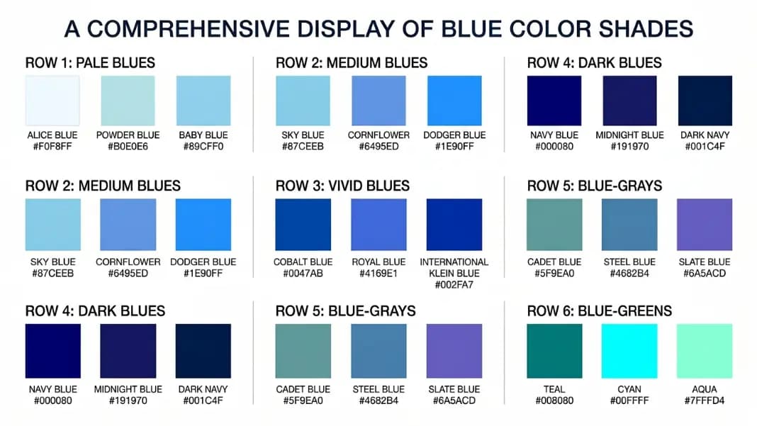
Cadetblue (#5F9EA0) leans toward teal. It has a noticeable green component in its RGB values (95 red, 158 green, 160 blue), which pushes it toward the blue-green boundary rather than a pure blue. The saturation is moderate and the lightness is mid-range, giving it the muted, slightly weathered quality that suits its military origin. The name comes from the grey-blue color used on cadet uniforms at US military academies in the 19th century. On screen, cadetblue reads as a calm, slightly institutional color. It is not a color you reach for when you want something bright.
Cornflowerblue (#6495ED) is more recognizably blue and considerably brighter. Its RGB is 100 red, 149 green, 237 blue, which places it firmly in the blue range with just enough green to keep it from being a primary blue. The name comes from the cornflower (Centaurea cyanus), a wildflower that grows in European grain fields. The cornflower is a medium periwinkle blue, and the CSS name captures that shade well.
Cornflowerblue at 14 characters is one of the longer CSS color names on the specification. If you are curious about other long names in the full CSS named color set, the longest color names guide covers which CSS names are the most unwieldy and why they were included in the specification.
For checking whether either shade has enough contrast against a background color you are using in a design, the contrast checker will give you the exact WCAG ratio and tell you whether it passes AA or AAA for normal and large text.
Chartreuse: The Color Named After a French Monastery Liqueur
Chartreuse (#7FFF00) is the color that consistently surprises people when they see it for the first time. Most assume chartreuse is some kind of muted yellow-green, similar to olive or lime. The CSS named color is nothing like that. It is a vivid, almost aggressive yellow-green at full brightness and maximum saturation: 127 red, 255 green, 0 blue.
The name comes from Chartreuse liqueur, made by Carthusian monks at the Grande Chartreuse monastery near Grenoble in the French Alps. The recipe has been produced since 1737 and is still made by the monks today. The liqueur itself is a yellow-green color, distinctive enough that it gave its name to the entire hue. That makes chartreuse one of the oldest color names in the CSS list in terms of the thing it is named after.
The pure CSS chartreuse (#7FFF00) is close to what designers sometimes call "electric lime" or "neon green," and it is considerably more saturated than web-safe lime (#00FF00). In practice, chartreuse is difficult to use in most design contexts because of that intensity. It works as an accent against very dark backgrounds, and it appears often in sports equipment design and athletic branding where high visibility matters.
If you want to work with lighter or darker versions of chartreuse rather than the pure CSS value, the tints and shades generator produces a full 11-step scale from white through any input color to black. Tints of chartreuse move toward a more usable pale yellow-green. Shades move toward a darker olive territory.
Coral, Crimson, and Chocolate: The Warm-Toned C Colors
Three of the eight C-colors sit on the warm side of the spectrum: coral, crimson, and chocolate. All three have rich real-world origins for their names, and all three are noticeably different from each other despite sharing the warm hue family.
Coral (#FF7F50) is a warm orange-red named after the color of red coral sea organisms. Its RGB breakdown is 255 red, 127 green, 80 blue. The high green component gives coral that distinctive warmth that separates it from a pure orange-red. CSS coral is used heavily in UI design for buttons, notifications, and accent elements where you want something warm and attention-getting but not as harsh as pure red.
Crimson (#DC143C) is a deep red with a slight blue component: 220 red, 20 green, 60 blue. That blue pushes crimson toward berry-red territory rather than fire-truck red. The name has a long history. Crimson originally referred to the color of dyes made from kermes insects, which produced a deep, slightly blue-tinted red. Kermes dyes were used in medieval textiles for royal and ecclesiastical garments. CSS crimson captures that deep, slightly cool quality. It is noticeably different from CSS red (#FF0000) when placed side by side.
Chocolate (#D2691E) is a warm brown-orange: 210 red, 105 green, 30 blue. It is named after the appearance of dark milk chocolate, which has that characteristic orange-brown cast before it cools. Chocolate is one of the few CSS named colors that sits clearly in the brown zone. It is useful in design work involving food, wood textures, and earthy palettes.
Cornsilk and Cyan: The Pale and the Pure
The remaining two C-colors sit at opposite ends of the saturation scale. Cornsilk is one of the palest colors in the entire CSS named set. Cyan is one of the most saturated.
Cornsilk (#FFF8DC) is named after the silky white-to-pale-yellow threads inside a corn cob. Its RGB is 255 red, 248 green, 220 blue. The barely-reduced blue channel gives it a faint warm yellow tint that reads as near-white in most contexts. Cornsilk is useful for cream backgrounds, paper textures, and warm off-white designs where pure white feels too cold. Place it next to white (#FFFFFF) and the warmth is visible. Use it on its own and it reads as white to most viewers.
Cyan (#00FFFF) is the opposite: 0 red, 255 green, 255 blue. Pure maximum-saturation blue-green with no red component at all. Cyan is one of the three subtractive primary colors in the CMY model (alongside magenta and yellow) and one of the additive secondaries in RGB (created by combining green and blue channels at full value). On screen, cyan at #00FFFF is extremely bright and distinctive.

How Cyan and Aqua End Up with the Same HEX Value
Cyan (#00FFFF) and aqua (#00FFFF) are two names for exactly the same CSS color. This is not an error in the specification. It is the result of how color names were added to CSS at different points in the standard's development.
Aqua was the original name. It appeared in HTML 3.2 in 1997 as one of the 16 basic HTML colors, where it covered the pure blue-green at maximum saturation. Cyan was added later when CSS extended the named color set to align with the RGB and CMYK color models, where cyan is the standard terminology for this value.
Because both names were included in the specification and both map to #00FFFF, they are genuinely equivalent. Write color: cyan in a stylesheet and write color: aqua and you get identical output in every browser. There is no practical reason to prefer one over the other. If you work in environments that use the CMYK terminology, cyan makes more sense to use. If you are following older HTML conventions, aqua is fine.
The same situation applies to fuchsia and magenta, both of which are #FF00FF. CSS has two pairs of colors that share HEX values. Cyan and aqua are the C-example of this pattern.
This is the kind of detail that matters when you find a HEX code in someone else's CSS and cannot tell whether they meant to use one name or the other. The answer is that it does not matter: the output is the same.
Color Names Starting with C in Practice: Which Are Actually Useful?
Knowing that these 8 color names exist is one thing. Knowing which ones are actually useful in design work is a more practical question.
Cornflowerblue (#6495ED) is the C-color that appears most frequently in real design work. It is a natural choice for secondary buttons, link text on light backgrounds, and informational badge colors. The periwinkle quality makes it feel approachable without being too soft. It has enough blue to read as intentional and enough saturation to hold its own against white backgrounds.
Coral (#FF7F50) is the second most practically useful C-color. It works in food photography overlays, warm-toned user interfaces, and anywhere you need a warm accent that is not as heavy as red. Many design systems that want a "warm alert" color end up somewhere close to CSS coral.
Cadetblue (#5F9EA0) is useful in marine, outdoor, and health-adjacent branding where that slightly grey-blue-green quality reads as calm and professional. It is not a color you see often in consumer tech interfaces.
Chartreuse (#7FFF00), chocolate (#D2691E), crimson (#DC143C), cornsilk (#FFF8DC), and cyan (#00FFFF) are all useful in the right context but tend to need a lighter touch. Chartreuse and cyan are high-impact accent colors. Chocolate works in food and nature design. Crimson is a formal, historically weighted red. Cornsilk is a warm background neutral.
For any of these colors, pasting a HEX value into the color name finder returns the closest CSS named color using perceptual matching. This is the fastest way to understand what category a color belongs to when you are working from a HEX code and need to know what it is actually called in CSS.
How to Check What Any C-Color Looks Like in Your Design
The names in CSS are keywords, not previews. Reading "cornflowerblue" in a stylesheet does not tell you whether that shade works against the background you are using, whether the text on top of it will pass WCAG contrast requirements, or whether the color still looks right in the light and dark mode versions of your interface.
For contrast specifically: cyan (#00FFFF) and chartreuse (#7FFF00) both fail WCAG AA for normal-weight dark text on white backgrounds despite being high-brightness colors. This catches people off guard. Brightness does not guarantee contrast. The contrast checker shows you the exact ratio for any foreground and background combination, including any of the C-named colors.
For building out a palette: if you want to use cornflowerblue as a primary color and need a full range of tints and shades to build a design system scale, the tints and shades generator produces the complete range automatically. You put in #6495ED and get 11 steps from near-white through the base color to near-black.
The starting point for any of this is knowing which C-color you are actually working with. The list in the table above covers all 8. If you are working from a HEX code that might be close to one of them, the color name finder resolves the ambiguity in seconds. Paste the code, see the closest CSS name, and see the two colors side by side so you can judge the perceptual distance yourself.