You find a gradient you like on a design you are replicating. The colors are clear from the design file, but when you write the CSS, the angle is off. The gradient goes from top-left to bottom-right but your 45deg angle does not match on a rectangular element. You adjust the angle by trial and error and cannot get it to align correctly.
The CSS Gradient Maker at ToolCenterHub lets you adjust gradient colors, angle, and stops visually and copies the ready-to-use CSS. This guide covers how CSS gradient syntax works, why gradient angles behave differently than most people expect, how color stops control distribution and hard transitions, and the most useful gradient patterns for common design problems.
What Is a CSS Gradient?
A CSS gradient is a smooth color transition generated by the browser as an image. Unlike a flat color set with background-color, a gradient is set with background-image (or the background shorthand). The browser renders it at full resolution at any element size with no image file involved.
The three CSS gradient types are:
linear-gradient()transitions colors along a straight line in any directionradial-gradient()radiates outward from a center point in a circle or ellipseconic-gradient()rotates colors around a center point like a pie chart or color wheel
Linear gradients are the most widely used for backgrounds, buttons, and UI elements. Radial gradients appear in glow effects, spotlight overlays, and circular icons. Conic gradients are newer but useful for donut charts and color pickers.
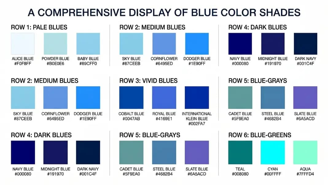
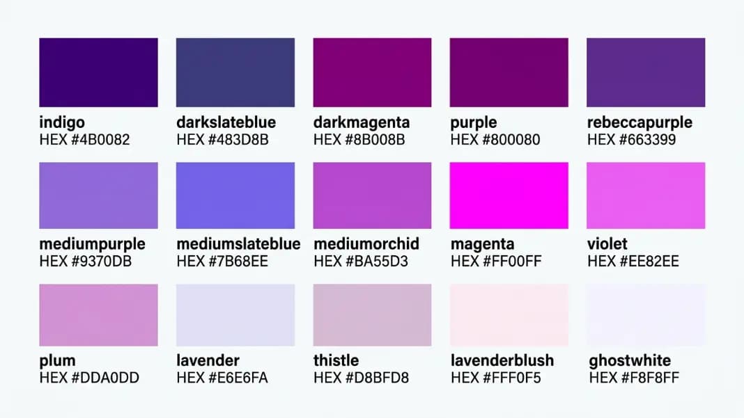
A basic gradient syntax: background: linear-gradient(to right, #2563EB, #7C3AED). This creates a gradient going from a blue (#2563EB) on the left to a purple (#7C3AED) on the right. When you need a named color rather than a raw hex, the shades of blue and shades of purple references let you pick by name and copy the hex directly into your gradient.
How Does the CSS Gradient Angle Work?
The angle parameter is where most gradient bugs originate, because CSS gradient angles do not measure from the direction most developers assume.
CSS gradient angles measure clockwise rotation starting from the bottom (pointing up). This is the opposite of what most people expect:
| CSS Angle | Keyword Equivalent | Visual Direction |
|---|---|---|
0deg | to top | Bottom to top |
45deg | to top right (only on square elements) | Bottom-left to top-right |
90deg | to right | Left to right |
135deg | to bottom right (only on square elements) | Top-left to bottom-right |
180deg | to bottom | Top to bottom (the default) |
225deg | to bottom left (only on square elements) | Top-right to bottom-left |
270deg | to left | Right to left |
315deg | to top left (only on square elements) | Bottom-right to top-left |
The practical implication: if you want a gradient that goes from top to bottom (the most common orientation), the angle is 180deg, not 0deg. 0deg points upward.
The keyword direction system (to top, to right, to bottom left, etc.) is often clearer than angles for standard orientations because the keyword describes where the gradient is going, not a rotation value.
Keyword Direction vs. Fixed Angle: Which to Use?
The difference matters most for diagonal gradients on non-square elements.
Fixed angle (45deg): The gradient runs at exactly 45 degrees from vertical regardless of element dimensions. On a wide rectangle, the gradient does not reach the corners. On a tall rectangle, the gradient overshoots the corners. The visual diagonal depends on the element's aspect ratio.
Keyword corner (to top right): The gradient runs from the bottom-left corner to the top-right corner. The browser calculates the angle based on the element's actual width and height so the gradient always runs exactly corner to corner. The angle changes with the element's dimensions.
Use keyword corners when you want the gradient to align with element corners. Use fixed angles when you want a specific visual angle regardless of element size, such as a consistent 45-degree diagonal texture.
For most UI work, keywords are the better default. A gradient that adapts to element dimensions stays correct when a layout changes width or a component gets reused in a different container. Fixed angles make sense only for deliberate design choices: a diagonal stripe pattern that must stay at exactly 45 degrees, or a consistent visual tilt across components of different sizes where cross-page alignment matters more than corner tracking.
How Do Color Stops Work?
By default, CSS distributes gradient colors evenly across the element. Two colors split at 50%, three colors at 0%, 50%, and 100%, and so on. Color stops let you override this distribution.
A color stop is a color value followed by one or two positions:
/* Evenly distributed (default) */
linear-gradient(to right, red, yellow, blue)

/* Manual positions */
linear-gradient(to right, red 0%, yellow 30%, blue 100%)
/* Red runs from 0 to 30%, then transitions to blue */

/* Hard color boundary (no transition) */
linear-gradient(to right, red 50%, blue 50%)
/* Sharp line between red and blue exactly at the midpoint */

/* Color stop with two positions (flat zone) */
linear-gradient(to right, red 20%, red 40%, blue 100%)
/* Pure red from 20% to 40%, then gradual transition to blue */
Hard stops (two identical positions) create the sharp edges used in CSS striped patterns and divided backgrounds without any image files:
/* Three equal stripes */
background: linear-gradient(
  to right,
  #E63946 0% 33.33%,
  #FFFFFF 33.33% 66.66%,
  #457B9D 66.66% 100%
);

Radial Gradient Syntax
Radial gradients radiate from a center point outward. The full syntax gives you control over the shape, size, and position:
/* Basic radial gradient */
background: radial-gradient(circle, #ffffff, #1a1a2e);

/* Ellipse (default shape) */
background: radial-gradient(ellipse at center, #ffffff, #1a1a2e);

/* Positioned center point */
background: radial-gradient(circle at 25% 75%, #ff6b6b, #4ecdc4);

/* Sized gradient */
background: radial-gradient(circle 100px at center, #ffffff, transparent);
The at keyword sets the center position. The position can use keywords (top left, center, bottom right) or percentage values. A spotlight effect typically positions the center above center, such as at 50% 30%, and goes from a light color to transparent.
The size keywords control how far the gradient extends:
farthest-corner(default): gradient reaches the farthest corner from the centerclosest-corner: gradient reaches the nearest cornerfarthest-side: gradient reaches the farthest sideclosest-side: gradient reaches the nearest side
In practice, circle and ellipse serve different visual purposes. Use circle when you want a perfectly round focal point, such as a glow centered on an icon. Use ellipse (the default) when the gradient should stretch to fill a wide rectangular element naturally, covering more surface area with less abrupt falloff. The ellipse shape adjusts to the element's proportions automatically, which is why most spotlight and vignette effects use ellipse at center rather than a fixed circle size.
Radial gradients from transparent to a solid color are also the correct technique for vignette effects on images: radial-gradient(ellipse at center, transparent 60%, rgba(0,0,0,0.5) 100%) placed over a photo darkens the edges while keeping the center clear.
Common Gradient Patterns
The patterns below cover the most reusable starting points. Each one works as a drop-in and is worth understanding at the syntax level so you can modify it confidently rather than copying blindly.
Subtle gray background gradient:
background: linear-gradient(to bottom, #ffffff, #f3f4f6);
The standard choice for a page background that needs visual depth without color. Keeps focus on content while avoiding the flat appearance of a single solid white. The difference between the two gray values is intentionally small.
Hero section with brand colors:
background: linear-gradient(135deg, #667eea 0%, #764ba2 100%);
A diagonal blue-to-purple gradient at 135 degrees (top-left to bottom-right). Replace the hex values with your own brand colors. If you are still choosing colors, start with the Color Schemes Generator to find a harmonious pair before feeding the hex codes into this gradient.
Spotlight overlay on a dark background:
background: radial-gradient(ellipse at 50% 0%, rgba(255,255,255,0.15) 0%, transparent 70%);
Layered on top of a dark image or solid dark background, this creates a subtle overhead light effect. The ellipse radiates from the top center (50% 0%) and fades to transparent at 70% of the element's size. Increase the opacity (0.15) for a stronger spotlight.
Text gradient (requires background-clip):
background: linear-gradient(to right, #f093fb, #f5576c);
-webkit-background-clip: text;
background-clip: text;
color: transparent;
This requires all three declarations working together. The most common mistake is forgetting color: transparent. Without it, the background gradient applies but the text color covers it and nothing visible changes. All three lines are required: the gradient sets the colors, background-clip constrains it to the text shape, and color: transparent makes the background show through.
Striped pattern (no image):
background: repeating-linear-gradient(
  45deg,
  #f3f4f6,
  #f3f4f6 10px,
  #e5e7eb 10px,
  #e5e7eb 20px
);
repeating-linear-gradient tiles the gradient infinitely. The hard stops at matching pixel values (10px / 10px) create the sharp stripe edge. Stripe width is controlled by the pixel values: both color zones are 10px wide here. Change the 45deg to 0deg for horizontal stripes or 90deg for vertical.
Fade to transparent (for overlay on image):
background: linear-gradient(to bottom, transparent 0%, rgba(0,0,0,0.7) 100%);
The standard approach for readable white text over a photograph. Position this as an absolutely placed div or ::after pseudo-element over the image. The text sits in the dark lower portion. Adjust 0.7 opacity for a lighter or heavier scrim.
Multiple Gradients on One Element
CSS allows stacking multiple gradient layers on a single element using comma separation. Layers listed first appear on top:
background:
  radial-gradient(circle at 20% 80%, rgba(120,119,198,0.3) 0%, transparent 50%),
  radial-gradient(circle at 80% 20%, rgba(255,107,107,0.3) 0%, transparent 50%),
  linear-gradient(135deg, #0f0c29, #302b63, #24243e);
This creates two colored glow spots over a dark diagonal gradient. The order matters: each radial gradient sits above the linear gradient because it is listed first.
Stacking gradients is one of the more underused CSS techniques. Most developers reach for an image overlay when a few layered radial gradients on a linear-gradient base would be lighter, faster, and fully editable. Stacked gradient layers also respond to CSS variables and media queries like any other property, which means a single component can shift its color scheme for dark mode without needing separate image assets. The Color tools section has additional utilities for generating full color schemes and picking palette colors to feed into your gradient work.