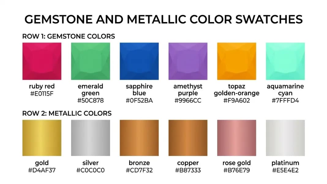
Every photo already contains a color palette. The beach photo has its exact shades of sand, seafoam, and sky. The café shot has the warm tones of exposed brick, dark espresso, and cream foam. The forest image carries the specific greens, browns, and filtered light of that particular afternoon.
Pulling those colors out of an image and into a usable format is what a color palette generator from image does. Instead of guessing which shades match your photo or eyedropping individual pixels one at a time, you upload the image and the tool identifies the dominant colors automatically.
This guide explains how the extraction process works, when it produces better results than building a palette from scratch, and how to apply what you get to real design work across several different contexts.
How image color extraction works
When you upload a photo to a color palette generator, the tool reads the pixel data from the image. A photograph can contain millions of distinct color values, so the tool groups similar colors together using a clustering algorithm. The most common approach is k-means clustering, where the algorithm divides all the pixel colors into a set number of groups based on color similarity and returns the center color of each group as a representative swatch.
The result is a palette where each color represents a cluster of similar tones from the original image. A photo of a sunset might cluster into a deep orange, a warm yellow, a muted coral, a soft purple, and a dark navy. Those five colors are not exact pixel matches from the image, but they capture the color personality of the photo as a whole.
The number of colors you extract changes what you get. Extracting three colors gives you the broadest, most dominant themes. Extracting eight or more starts to return subtler accent tones that appear less frequently in the image. For most design work, five colors is the right starting point.
When to extract from an image versus building from a color
Both approaches have clear use cases and the choice depends on what you are trying to match.
Use image extraction when you have a visual reference that defines the mood you want. If you are designing a website for a nature photography brand and you have a hero image you love, extracting from that image guarantees the palette fits the photo. The colors you get are already proven to work together because they came from the same source.
Use a color-theory-based approach when you are starting from a brand color or a specific requirement. If your brand uses a particular shade of blue and you need to build a full palette around it, starting from that HEX value and generating complementary or analogous colors gives you precise control over the relationships between colors.
The Image Color Extractor is built for the first scenario. The Color Palette Generator handles both, letting you switch between starting from an image and starting from a specific color depending on what you need.
Designing a website from a photo palette
One of the most common applications is website color design. Designers often start with a strong hero image and want the rest of the site to feel like it belongs with that photograph.
The typical process is this. Upload the hero image to the color palette generator and extract five dominant colors. You now have a palette that is visually coherent with your main image. Then assign each color a role in your design system.
A practical mapping for a five-color palette:
- Darkest color: Primary text and headings
- Lightest color: Page background
- Mid-tone: Card backgrounds and section fills
- Most visually distinct color: Primary buttons and links
- Remaining color: Accents, borders, hover states
Convert each swatch to a CSS custom property and apply it throughout your stylesheet. The result is a site that feels unified because every color came from the same visual source.
For accessible web design, check that your text and background color combinations meet contrast requirements after extraction. Photographs do not guarantee accessibility, so running your chosen text and background colors through a contrast checker before finalizing your design catches problems early.
Wedding color palettes from photos
Wedding color planning is one of the strongest use cases for image-based palette generation because the inputs are so tangible.
You have a venue. You have flowers in mind. You saw a bridesmaid dress fabric you liked. You saved an inspiration photo from a design account. All of those real-world visual references are images you can upload, and each one can produce a palette that you know fits your aesthetic because you chose those references based on how they looked.
The process is straightforward. Upload a photo of your venue's interior or exterior and extract five colors. You now have a palette pulled directly from the space where the wedding will happen. Upload a photo of the flowers you want and see how the colors compare. If the two palettes overlap significantly, the combination will work. If they clash, you know before committing to anything.
This approach works much better than choosing from color name lists or swatches on a screen, because what you see in a photo and what you see on a monitor have an emotional context that a flat color chip does not. Extracting from photos you already love produces palettes you are more likely to love, because the preference was there from the start.
For keywords like "generate color palette for wedding" or "wedding color palette generator," the image extraction method is simply more practical than building from theory, because most people planning a wedding are working from references they found visually, not from color theory principles.
Interior design and room planning
Interior designers and homeowners use image-based palette generation the same way. You take a photo of a sofa fabric, a tile you liked at the showroom, a rug texture, or a room from an interior design account, and you extract the colors that are already working in that image.
This is useful because interior design involves physical materials with specific color properties that can be hard to pin down. Fabrics reflect light differently than paint. Tile has texture that affects how color reads in a room. Extracting from a photo of the actual material gives you a more honest representation of its color than a printed swatch, because the photo captures how the material looks under light.
The extracted palette can then guide paint color selection, furniture choices, and accent decisions. If your sofa extracts as a warm taupe, a dusty green, a cream, a terracotta, and a charcoal, you have a palette that you know works with your existing piece. Any paint color or accessory you add from within that palette will integrate naturally.
Brand and visual identity
Brand color work sometimes starts with a photograph. A founder might have a mood board image that captures exactly what the brand should feel like but not know how to translate it into specific colors. Running that image through a color palette generator produces a concrete starting point.
From there, the extracted colors can be refined. The raw palette from a photo is a starting suggestion, not a finished brand system. You might shift the primary blue slightly to feel more confident, desaturate the accent color for professionalism, or swap one color for a more accessible alternative. But having five real colors to react to is much faster than building from nothing.
For brands that need to extend a palette to more colors, the Color Scheme Generator lets you take one of the extracted colors and generate complementary, analogous, or triadic relationships from it. This combines the photo extraction approach with color theory to build a more complete system.
The Color Tools section has the full set of tools for this kind of work, from extraction to scheme generation to tints and shades.
Digital art and illustration
Artists who work digitally often build their color palettes from reference photos rather than from theory. Extracting from a reference photo you plan to paint from gives you a limited palette that already fits the subject.
This is a long-standing technique in traditional painting called limited palette work. Using fewer colors that are already harmonious with the subject produces more cohesive results than mixing from a wide range of available colors. Image extraction formalizes that process.
Upload your reference photo, extract five or six colors, and restrict your digital painting to those swatches. The result tends to have more color harmony than painting without constraints, because you are working within the natural color range of your reference rather than introducing colors that the scene does not contain.
For character design, concept art, or any illustration where a cohesive color identity matters, extracting a palette from a visual reference or mood board image is one of the fastest ways to establish a starting palette.

How to get better results from image extraction
Not every photo produces an equally useful palette. A few factors affect output quality.
Photo with a clear mood or consistent tone. Landscape photos, still life shots, and professionally photographed interiors tend to produce coherent palettes because the images have intentional lighting and color direction. Random snapshots with mixed lighting produce more scattered results.
Avoid images with large white or black areas. If your image has a plain white background taking up sixty percent of the frame, white will dominate the extracted palette and crowd out the more interesting colors. Crop the image to focus on the subject before uploading.
Try different images from the same source. If you are extracting from a venue, upload several photos taken at different times of day or from different angles. Compare the palettes across photos. Colors that appear consistently across multiple images are the most reliable representatives of the space.
Check the extracted colors individually. Sometimes the extraction algorithm returns a color that feels slightly off, usually because it averaged two colors that appear in different parts of the image rather than finding a true dominant tone. Most tools let you click on individual swatches and adjust the HEX value. Small tweaks to brightness or saturation can make an extracted palette more practical without losing its character.
Applying your palette after extraction
Having a set of HEX codes is the starting point, not the end.
Copy the HEX values from your extracted palette and convert them to CSS custom properties if you are working on a web project. Store them in one place in your stylesheet so you can update the whole palette by changing values in a single location rather than hunting through your code.
For print and physical design projects, convert the HEX values to CMYK for accurate printing. The HEX values from an image extraction are screen colors by default, and they will print differently without conversion.
For Tailwind CSS projects, the Color Palette Generator includes an export option that formats your colors directly as a Tailwind theme configuration object, so you can drop the palette into your config file without any manual conversion.
Keep a record of your palette with both the HEX codes and any names you assign to each color. Naming colors by role rather than appearance, "primary" rather than "blue-ish teal," makes it easier to apply them consistently when working on a project over time or collaborating with others.
What to do when the extracted palette needs adjustment
Extraction gives you colors that are present in the image, but those colors are not always in the right proportions or the right tone for practical use.
Common adjustments:
Darken the darkest color for text. The darkest color extracted from an image is often still too light for comfortable reading on a white background. Pushing it toward true black or dark charcoal while keeping the hue improves legibility without abandoning the palette.
Lighten the lightest color for backgrounds. Similarly, the lightest extracted color may be off-white or a pale tint. Lightening it slightly produces a cleaner background without looking disconnected from the palette.
Increase saturation on the accent color. Accent colors from real-world photos are often muted because real materials and lighting desaturate colors naturally. Boosting saturation on the color you plan to use for buttons or links makes it feel intentional and functional rather than washed out.
Treating the extracted palette as a strong starting point and making small targeted adjustments is the practical workflow. The extraction does the hard work of finding harmonious colors. The refinements make them work at the scale and context of your specific project.
For a full workflow from image to finished palette, start at the Color Palette Generator, extract your colors, and use the rest of the Color Tools to check contrast, generate tints and shades, and build out a complete system.