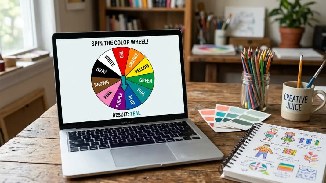
The canvas is blank and you have been staring at the same color set for twenty minutes, cycling through three combinations without committing to any of them. Every deliberate choice carries a question about whether it is the right one. A color wheel spinner removes that question by making the choice for you.
The wheel spinner accepts any list as segments. Add color names, shade descriptions, or palette labels, spin once, and the result is your starting constraint. The constraint is what makes the tool useful for artists: working within a random palette is harder than working with free choice, and the restriction consistently produces more distinctive work than open-ended color selection.
This guide covers how to build an artist-focused color wheel, the specific challenge formats that come from palette restriction, how to use the wheel to teach color theory relationships, and a section on CSS named colors as a starting point for designer-focused wheel builds.
What Constraints Do That Deliberate Choice Cannot
The most common block in art practice is not a shortage of skill. It is a shortage of decision. Open-ended choice requires deciding subject, style, and colors before any mark is made. The longer the pre-decision phase runs, the more pressure accumulates around whether the eventual choice is good enough.
A palette restriction acts at the foundation of every color decision in the piece. The limited set of available colors determines what relationships are possible, what the piece can emphasize, and what the artist must work around. The restriction creates the problem. Solving the problem is the work.
Random palette restrictions are more generative than self-chosen restrictions because you cannot pick colors you already know how to work together. A wheel that lands on Burnt Sienna, Cobalt Blue, and Chartreuse forces color relationships you would not deliberately create, which means you have to actually think through the combinations rather than rely on combinations you have used before. The unexpected pairings are where the most instructive sessions happen.
CSS Named Colors: A Designer's Art Challenge Wheel
CSS has 147 named colors that browsers recognize by name in web code. These are not generic color words. They are specific, professionally curated colors with exact hex values, spanning the full visible spectrum with names that are more interesting and specific than the standard primary-secondary set.
Some worth knowing: Chartreuse (#7FFF00), Coral (#FF7F50), Cornsilk (#FFF8DC), DodgerBlue (#1E90FF), FireBrick (#B22222), GoldenRod (#DAA520), HotPink (#FF69B4), IndianRed (#CD5C5C), MediumSlateBlue (#7B68EE), Papayawhip (#FFEFD5), Peru (#CD853F), SaddleBrown (#8B4513), SandyBrown (#F4A460), SteelBlue (#4682B4), Tomato (#FF6347), Turquoise (#40E0D0).
For web designers who also produce visual work, a CSS named color wheel creates a challenge format where every result maps directly to a usable code value. The piece produced from a CSS color wheel session can have its palette extracted and applied to a UI without any color conversion step.
For artists without a design background, CSS named colors are simply a more interesting and varied set than the usual basic names. Loading a wheel with Salmon, SteelBlue, GoldenRod, MediumOrchid, Tomato, and ForestGreen gives a more specific and challenging palette than Red, Blue, Yellow, Orange, Purple, and Brown.
A working CSS art challenge wheel (16 colors): Coral, SteelBlue, GoldenRod, MediumOrchid, Tomato, ForestGreen, DodgerBlue, Sienna, HotPink, Teal, Chartreuse, IndianRed, SandyBrown, MidnightBlue, Lavender, OrangeRed
Spin three times with no repeats to generate a three-color palette. Every combination from this list is workable and produces color relationships you would not build deliberately.
Teaching Color Theory with a Spinner
A color wheel spinner loaded with color positions turns abstract color relationships into a hands-on activity. This works for art classes, design courses, and self-directed study.
The color position wheel: Load the wheel with twelve positions: Red, Red-Orange, Orange, Yellow-Orange, Yellow, Yellow-Green, Green, Blue-Green, Blue, Blue-Violet, Violet, Red-Violet. This approximates the traditional twelve-position color wheel in spinner form.
Complementary color exercise: Spin for a starting color. The complement is the color six positions away on the loaded wheel. Name the complement before looking it up. Produce a piece using only the starting color and its complement plus white and black. Repeat with different starting spins. After ten sessions, the complementary relationships become intuitive rather than calculated.
Analogous color exercise: Spin for a starting color. The analogous colors are the two colors adjacent to it on the loaded wheel. Produce a piece using those three neighboring colors. Analogous palettes are inherently harmonious because the colors share a hue component, which makes them suited to mood-driven work where harmony matters more than contrast.
Triadic exercise: Spin for a starting color. The triadic partners are four positions away in each direction on a twelve-position wheel. The three triadic colors form an equilateral triangle on the color circle. Triadic palettes are high-contrast but balanced, which is why they appear frequently in logo design, poster art, and editorial illustration.
For a classroom: Run the exercise as a group. One student spins. The class identifies the complementary or triadic partners together before anyone looks them up. The random starting point removes any individual's preconception about which colors they expected to work with, which makes the identification exercise honest rather than confirmatory.
Palette Restriction Challenge Formats
These formats come from online art communities and work as individual practice sessions or as group challenges.
Three-color spin challenge: Spin three times, removing each result before the next spin. Use the three landed colors plus black and white only. This is the most common community challenge format because the three-color limit forces compositional decisions that open palettes obscure. The simplicity of the constraint makes results comparable across participants.
Single color plus neutrals: Spin once. Use only that color, white, and black. Monochromatic work forces control of value and saturation as the only tools for contrast and emphasis. Most artists avoid this constraint because it is genuinely difficult. That difficulty is what makes it the most instructive one for understanding how color fundamentals work without the safety net of hue variety.
Complementary pair challenge: Spin for the dominant color. Find the complementary color directly across the color circle. Use those two colors plus neutrals. Complementary pairings create maximum visual tension and are harder to balance than analogous palettes. Random starting points produce pairings you would not deliberately choose: orange and blue, yellow-green and red-violet. Non-obvious pairings are where the most interesting work happens.
Palette swap challenge: Spin for three colors. Apply them to a reference composition using a piece you have already completed. Recreate the same subject and structure with the new palette. The composition stays fixed. Only the colors change. This isolates the effect of the palette from other design decisions and shows clearly how much the same structure reads differently depending on color alone.
Timed restriction session: Set a timer for thirty minutes. Whatever the wheel picks is the palette for the session. No adjustment allowed after the spin. The time pressure combined with the color constraint produces a focused session that deliberate open practice rarely matches. The combination prevents both color indecision and the tendency to refine indefinitely.
Drawing Challenge Formats for Groups
Random color wheels work well in group art sessions where everyone draws simultaneously from the same or independently spun constraints.
Shared palette challenge: One person spins for three colors. Everyone in the group uses the same three-color palette and produces a piece within a set time. Results are compared at the end. The shared constraint makes the comparison meaningful: the differences come from individual approach, not from palette differences.
Progressive palette: Each person starts with one spun color. Every fifteen minutes, spin to add one more color to the available set. By the end of the session, each person has four colors. The progression shows how the piece changes as options expand, which is a useful demonstration of how palette size affects visual complexity and decision-making under constraint.
Palette trade: Two participants each spin independently for three colors. They then swap palettes and use each other's randomly assigned colors for their piece. Each person works with a palette that nobody reviewing the finished result had any input in choosing.
Disconnect palette: Spin for three colors that do not obviously belong together. The challenge is to produce a piece where the palette feels intentional and unified despite the random origin. Solving the disconnect problem develops color intuition more effectively than working with a harmonious palette that does not require reconciliation.
Building Your Art Challenge Wheel
Open the wheel spinner, clear the default entries, and add your color options one per segment. Keep names specific enough to be actionable: Sage Green is more useful than Green for an art decision. Warm Terracotta is more useful than Orange. Vague color names produce results that require a second decision about which version of that color applies.
For a general practice wheel, load the CSS named color set above or build your own set from the pigments or digital swatches you actually work with. Only add colors you can actually use when they come up. If a color is not in your current paint set or digital palette, do not add it to the practice wheel.
For a teaching wheel, load the twelve-position color circle. Label each entry exactly as you would name it in class: Red-Orange rather than Vermilion, Blue-Green rather than Teal. Consistent naming across the wheel and across lessons prevents confusion when students try to match wheel results to color theory terminology.
For a group challenge wheel, agree on the list before the first spin. Any color someone adds that they know others find difficult to work with undermines the challenge format. Every segment should be a genuine option the whole group accepts.
Color Wheel for Digital Design
For designers working in UI, web, or graphic design, the color wheel spinner serves a different but related purpose: breaking out of the color relationships you default to when choosing deliberately.
Load the wheel with CSS named colors or hex values from your design system. Spin to pick a random accent color for a component, a random background for a landing page variant, or a random highlight for a typographic element. The spin produces a direction to evaluate, not a final answer to use unchanged.
For broader exploration, load the wheel with relationship labels rather than specific colors: Complementary to brand primary, Analogous warm, Analogous cool, Split complementary, Triadic partner. Spin to pick a relationship type. Then apply the corresponding color from your existing palette system. This keeps the result within the design language while introducing a direction you would not have reached by deliberate selection.
The color tools section covers extracting palettes from reference images, building cohesive color sets, and identifying specific color names from visual samples. Those tools work alongside the wheel: extract a palette from a reference image, load the extracted colors as wheel segments, and spin to assign which extracted color becomes the dominant element in the next design decision.
For any random selection that goes beyond color, the random tools section covers the subject and theme tools that combine with a color wheel to create fully constrained drawing prompts rather than just palette restrictions.